Phillip Phillips Steps Behind The Light And Emerges Triumphantly

We waited, we listened to the snippets, we counted down the days, and finally, it is here. To the sheer joy of Phillip Phillips fans everywhere, Behind The Light was released at midnight on Monday; within an hour it had reached number 1 on the Pop Charts on iTunes, a testament to the huge anticipation and the incredible support from Phillip’s ever growing fan base. It’s only been a few hours and a few listens, but I feel I can say without hesitation that Behind The Light has exceeded all my expectations and hopes, and keeps proving that Phillip Phillips has arrived and is here to stay.

It’s easy to make comparisons, but it’s inevitable to look back and see how much Phillip has accomplished in just two short years and admire his steady and assured growth as a musician and as a songwriter. And in Behind The Light we see him not only expand his song writing vocabulary but bring into the studio the energy and exhilaration that have come to define his live performances.

I feel that confidence has always been an important quality of Phillip’s music. But where you saw the confidence you also saw the effort behind some of the songs on The World From The Side Of The Moon. In this new group of songs you can feel not only a new maturity but a new ease in his songwriting, a more direct way of expressing his ideas while still conveying the same or more complexity. This goes both for the lyrics and the music, but in particular for the lyrics. Phillip has said that the new album is about growing up, about both the fear and the beauty we experience as we get older. But another recurrent theme is truthfulness, which he explores through many images of darkness and light, fire and release. So though musically the album may be very different from song to song, the lyrics unify it in tone and feeling.

The album starts with “Searchlight,” a song whose rousing beat and background vocals contrasts with delicate lyrics about healing and redemption. It’s a perfect introduction to the journey the music will take you: there is light and darkness in every song, mournful undercurrents to the most hopeful of songs and light and hope shinning in the most sorrowful ones.

By the time Phillips sings “I see myself again/Behind the Light I flicker” in “Alive Again,” we are well into the themes of the album, the words here conveying the idea of what he is when in darkness, the true side of himself that nobody gets to see. And in “Unpack Your Heart” he touches again on acknowledging what is hidden, of revealing ourselves as we are to each other, of letting go without fear:

“Meet me where the sunlight ends/Meet me where the truth never ends/Bring all that you’re scared to defend.”

I tend to be moved more easily by music than lyrics, but this album contains so many intimate, carefully crafted lyrics, that I think they really define Behind The Light; nothing here is an afterthought. The world From The Moon already showed that Phillip has a beautiful way with words and here we can see his eye as writer sharpening and blooming, finding just the right words to create immediate images in your head that break your heart or fill it with hope (“Alive Again”), convey the passion of unending love (“Raging Fire”), the pain that creeps into a tortured mind (“Trigger”), and the heavy heartedness of fear (the quiet, repetitive mantra of “everything will be better now” in “My Boy”).

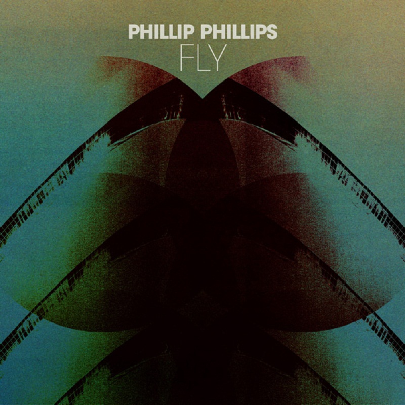
Musically, Behind The Light is very diverse, going from the stripped but incredibly rich sound in a song such as “Face,” to the sparse percussion and baroque sounding strings in “My Boy,” to sleek, intricate drums and incendiary pedal steel guitar in “Fly;” each song is allowed to be what it needs to be.  Phillip has said many times that with Behind The Light he set out to do an album that would capture his “live band” sound and I think he really succeeded in doing that; the album has an incredible, organic energy throughout. A good example is “Don’t Trust Me,” a fantastic funky song (with some of the most introspective lyrics on the album) which really captures the live feel of the band, with amazing bass and horns that will be explosive in concert. As always, Phillip’s vocals are passionate and stirring, with subtle inflections and phrasing that brought tears to my eyes more than once.

Looking at the liner notes we can see Phillip reunited with the same team that made his first album such a great success: producer Gregg Wattenberg, and writers Derek Fuhrmann, Todd Clark and David Ryan Harris. It also includes an amazing new collaboration with Finian Greenall of Fink on “My Boy.” An added thrill is seeing Phillip listed as a producer on the album and the excellent members of his band playing on it, Errol Cooney on guitar, Philip Dizack on trumpet, Dave Eggar on cello, the incredible Jason Thomas on drums, “JJ” Smith on bass and Bobby Sparks on keyboards.

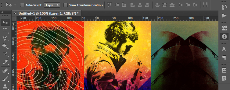
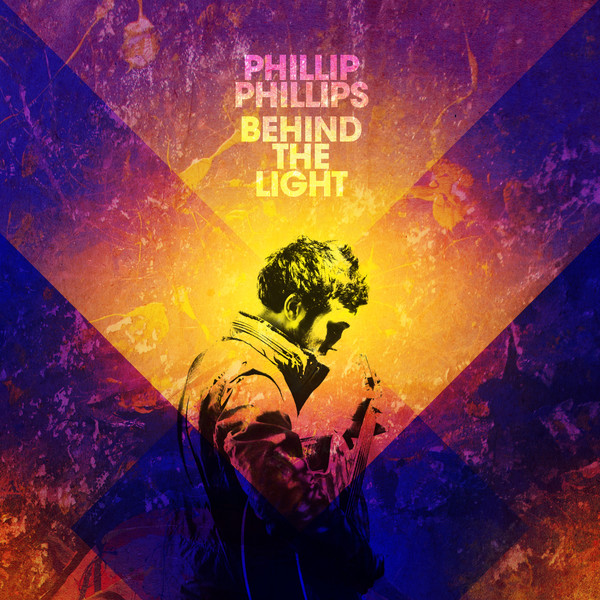
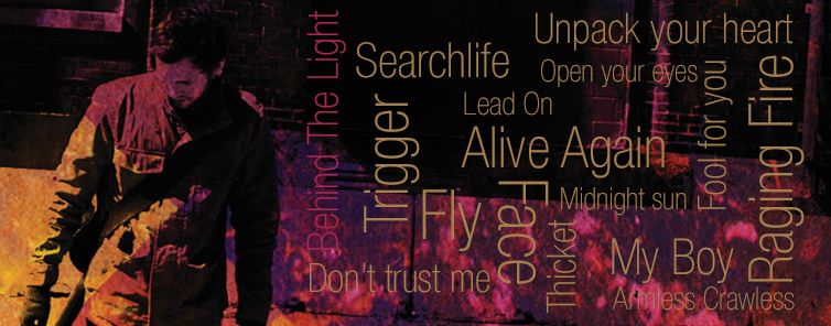
Most people will be downloading this album, but if you happen to own a physical copy, you will get to enjoy the amazing art by Rob Carmichael, which brilliantly captures the theme of darkness and light, shadows and fire throughout. Take a look at the images as you listen to the album and you’ll see the themes beautifully play out, poignantly, until the end.

I am the ultimate romantic, and as a fan, I care about artistic integrity and depth. Behind The Light has both–I never doubted it would. With this album Phillip has opened up and shown us what is behind the light; what we find there is beautiful to see.

Review by Andreina Romero

[socialpoll id=”2202338″]

Behind The Cover-Exclusive Interview With Behind The Light Designer Rob Carmichael

From optical illusions, to beautiful photo manipulations, to intricate and carefully crafted designs, Artist/Designer Rob Carmichael’s work cannot really be categorized as mainstream. Owner of LA/NY based SEEN Studio and main collaborator with indie band Animal Collective, Carmichael’s designs and album covers trick the eye and engage your mind. Phillip Phillips’ cover art for upcoming sophomore album Behind The Light, designed by Carmichael, is no exception. With its deep colours and multi-layered textures, it seems to point to a new, bolder, more complex direction for Phillip’s music. PhillPhillcom had the great pleasure to talk to Rob Carmichael recently about his work on Behind The Light, the process and inspiration behind his designs and the current state of album cover art. Read our conversation below.

PhillPhillcom: You have worked with many musicians in the past through your work at SEEN, and also through your former record label Catsup Plate. How do you approach the process of designing an album cover and how much does the music play a role in that process?

Rob Carmichael: Well, I always say that I only hear the music about half the time. A lot of times the musicians are still working on the music, or it’s being mastered, or is just not ready yet. So a lot of times I don’t hear the actual music, which is interesting and something a lot of people are surprised to hear. But usually, the process for me is more talking with the musician and trying to see what they think the music is about. Because music is pretty open-ended, so what I think it sounds like and what the artist thinks it sounds like can often be very different. So I find that talking about what they feel is going on is actually the best place to start and even more important than hearing the music.

PhillPhillcom: How did you get to work with Phillip? Did you know his music beforehand or was “Raging Fire” and Behind The Light your first contact with his music?

RC: I didn’t actually follow American Idol that closely–I knew a little bit of the story. I knew some of the bigger singles from the last album because they were everywhere, but I wasn’t super familiar. I have a place that represents me for design work called Probation–they are based in London but they do a lot of work here in the States. They had gotten my portfolio to Interscope and Phillip wanted something different from what had happened before–he didn’t just want a pretty picture of him with type and just call it good–He wanted something a little bit more, and I guess he saw what I did and was interested. But I didn’t have any contact with him until a little bit later in the process.

PhillPhillcom: So how did you get the briefing? Did you have a chance to meet with Phillip to discuss ideas about the design a little bit more?

RC: Initially we worked on a song that did not actually come out [called] “Midnight Sun.” I worked on that first and I heard a very rough [version]. I went for a meeting in LA and Phillip was still in New York working on it and I heard the work in progress at his management company’s office, just to get the feel. But I only heard it once (laughs) and I tried to keep it in mind as best possible. [So] when I was working on “Midnight Sun,” they gave me a bunch of photos of him and they said, “We want you to take this kind of far out.” I said, “OK.” And I’m thinking, “This is American Idol, there is a lot of money at stake, they can’t really mean that” (laughs). So I went back and I did some stuff that I thought was pretty far out there and I sent it in and Phillip and his people said, “No, we thought you were really going to bring this.” Which is funny because a lot of the really out there indie bands that I work with would have been a bit uncomfortable with the stuff I initially sent to Phillip. [But] he and his people were really adventurous and they literally said to push it more, so I said, “There is not going to be much Phillip left if I push it more” and they said, “Great, yes, do it!”  In the end, there is Phillip on all the stuff but it’s just different from what I thought they wanted initially.

PhillPhillcom: How was it working with Phillip?

RC: Once I started to work directly with Phillip, it was great. He was very clear in what he thought, but he was also very open to what I was going to be doing, which is actually rare: a lot of musicians are unclear about what they want, but are very, very specific about how they think I should go about it. So I just explained what I thought and we talked a little bit about how I could do things so that he was there, but not there in a stereotypical pop star kind of way.

phillip-phillips-previews-single-raging-fire

PhillPhillcom: What was the main idea behind the designs for “Raging Fire” and for Behind the Light? For example, the colors used on Behind The Light are quite striking and different from anything around right now, not really on trend. How were the colors chosen?

RC: There are a few things. One, it’s just how I like to work. I like a lot of more bold colors and a lot of texture to things. In terms of the designs and what the inspiration was, I guess a lot of the things I’m interested in are ways to take a photo or an image that exists in the real world and also geometric forms, [and] I like to combine those two things, because, in my mind, the eye tries to make sense of a perfect line and then it hits something that it’s clearly a photo and it gets a little confusing and you are trying to figure it out. So what I try to do is get somebody interested enough to interact with the cover, or even if it’s on a screen, to get them to lean in to try to figure out what’s going on. I’m [also] definitely into reflection because it does a similar thing: is not really possible to have two perfect versions of something. So “Raging Fire” has Phillip reflected and this sort of circular radiant on this textured background. But it didn’t feel very fiery until we found that sort of [radiant] lines. And I try not to be too literal but, in that case, it felt like it needed something sort of fiery. For the colors, I tried to tweak them until I had something that was kind of warm, like glowing or hot.

[For] Behind The Light, around the time that we were talking about it, he was talking about the first video (“Raging Fire”). The day they did the photo shoot for me, was the day they were shooting that video. He had one day off and they did it all together. Phillip initially said he wanted some photos of him being painted for the actual record cover, which I thought was good, but that it would limit it to looking like the single’s video and not the album as whole. So I tried to think painterly and bright as much as possible so that it kind of got that feel without being exactly like the video. So it’s a lot of blues and oranges, this sort of rainbow without being cloying or really cheery. Because some of the songs have a little bit of darkness to them too, so I was trying to get color in without it being overly happy–just trying to do something interesting.  

PhillPhillcom: If we look in detail, the background for Behind the Light looks paint-like, or like splatters of paint on a canvas…

RC: Most of the images that I used were from the photo shoot. The photographer did a great job, and what he did the best was to take pictures of things that most people wouldn’t think were worth taking pictures of. So the background there was just after Phillip had gotten up from being painted, there was just what was left over. I thought, “This is great!” because I’m not a painter and I can’t draw or paint. But here it was, this very painterly texture to use and it was perfect. Same thing for the picture of Phillip on the cover. He had taken a lot of really great posed shots, but that shot, it was actually Phillip warming up. The rest of the photo you can see the van is behind him and they were going to the shoot and he was literally just getting off or getting on the van and it seems like he was tuning his guitar. And it wasn’t something that anybody would think to take a picture of. But it was really this great composition, and then when I made it black and white, it felt very dramatic. So that’s the sort of thing I was looking for–that sort of, off-the-cuff, Phillip not quite looking directly at the camera–that seemed more in the spirit of how he likes to present himself.

Phillip-Phillips-Fly-iTunes

PhillPhillcom: Apart from the cover art for “Raging Fire” and for Behind The Light, a new cover has been circulating in the last couple of weeks for another song called “Fly,” and it’s quite different from the other two; very abstract, reminiscent of 1970’s classic rock album covers. Did you also work on that?

RC: Yes, I did that one too. I was just trying to push things more and Phillip thought of that song, as he put it, as a little bit different from everything else. Initially, I did some things that were fairly close to the themes of the album. But he felt that [the song] was different enough. It was funny, because that one was something that I started working on, trying to fit a picture of him and it wasn’t really working and I was kind of frustrated. So I started to mess around and it started to come together and I thought, “I just throw it in there, I’m sure everybody will think it’s ridiculous, he’s not even on it.” But then, that’s the one Phillip chose. Normally record labels really want to be involved in the decisions about the artwork, but for Interscope, it was really whatever Phillip wanted and felt was appropriate as long as it had the title and the name on there. So Phillip liked that one and said, “Oh, that’s it.”

Phillip-Phillips-Fly

PhillPhillcom: So far, looking at the “Raging Fire,” “Fly” and the Behind The Light covers, there seems to be a theme going of the double and mirror or crisscrossing images. Is this something you brought into the design? Or is this something that Phillip talked about or that is present on the album in some way?

RC: Again, I didn’t get to hear the album. I got to read the lyrics–actually–I think I got to read the lyrics after the front cover was kind of decided. But I think the geometry and the mirror theme was coming from me. So Phillip didn’t say specifically that, but him being present on the cover was something that everybody felt made sense. So it was just ways to show him or put a piece of him there without doing this pretty, glamour thing, but to do something that felt artistic and interesting and that made people work a little bit–not in a bad way–it’s just more fun if you have to figure out that it’s mirrored or you can’t totally tell what’s going on. Because the way I still think of designing art for music and the way I listen to records is, I put on the record and then I look at the cover and try to figure it out. That doesn’t happen as much anymore with digital stuff, but I do think that, for people that do want to engage in that way, it’s good to give them something to really think about or look at.

PhillPhillcom: Phillip has talked about how fast the song “Raging Fire” came about and was selected as the first single for the album. How much time did you have to make the “Raging Fire” cover art? What about for Behind The Light?

RC: Yeah, I only had a few days to do it. [For] “Raging Fire” I had 3 or 4 days; it was definitely fast. But I tend to work fast because I have a kind of process where I just basically have to block out the time to mess around until things start gelling. Behind The Light–I like that a little bit more than “Raging Fire” and I think it’s because I had a little bit more time to work on it and tweak it. Not that “Raging Fire” is bad, but there are some subtleties to Behind The Light that are stronger and it’s just because I had more time to work on it.

PhillPhillcom: Did you have to show Phillip many different designs before he approved the final art, or did he approve the first mock-up?

RC: I think for the first single there were probably about 10 different concepts that I sent. For the album there were about 6 or 7 ideas and initially the first version of what you see, Phillip didn’t like and I liked a lot, but it wasn’t as fully formed as it is now. So I took it upon myself to work on it more because I thought there was something there and then it got to the point where he did like it. And then it came down to Phillip deciding between two covers that he was stuck on which direction he would go.

PhillPhillcom: Nowadays, most people download music instead of buying a CD or a record. What do you think is the state of the album cover today?

RC: I think it’s still pretty essential. I think a lot less effort and time is put into the visuals by a lot of artists and a lot of record labels because you can get away with not doing it so well and maybe, if it’s a good song, it will still sell really well. What album art does, is start you on road to understanding the record before you hear it. If the Phillip Phillips’s cover was just black text on a white background and it said “Phillip Phillips Behind The Light,” it’s harder to know where to start with that. But as it is now, you have this very colorful, complicated image and hopefully that colors the way you are going to listen to the record. But it can be a tough business sometimes these days because a lot of people think you don’t need it. But I think having that visual connected to it, it locks it in people’s mind in a different way that if it is just boring or a throw away. If you think of the [records] that are so lodged in your brain, most of the ones that are meaningful have some of visual to start with that it’s meaningful to people.

PhillPhillcom: The other side of that is that people manipulate images so easily online today. For example, as soon as the covers for RF and BTL were announced, fans took to them and used them for their Twitter or Facebook accounts, even deconstructing the images for their profiles to show their support and to promote the album.  How do you feel about that? 

RC: There is another much smaller band I work with called Animal Collective. They have a very dedicated fan base–really enthusiastic and they do a lot of the same things. To me it reminds me, in a digital way, of something I used do when I was a kid. Which was that I would buy Rolling Stone and cut up photos of the bands or the album and put it on my wall or tape it down on my school binder. It’s kind of a natural human thing to want to participate as much as possible or in some small way in something you love or are passionate about. So if people are so interested in what it looks like and what I have done and they want to do something for themselves, I think it’s great.

PhillPhillcom: Will there be more of your work included on Behind The Light and what can we expect to see?

RC: Yes, I did everything in the CD, the typesetting, everything. I think some of the themes you see on the cover kind of continue through the rest of it. I tried to make it feel like a world as much as possible, so there is a lot more of the geometry, there are some more photos, things are less centrally laid-out. I have a very straight forward type of graphic style, I don’t like to cram songs really small, so I tried to put things as they are and let them overlap. There are some other great photos of Phillip that if you knew where I pulled them from, there are not the ones anyone would normally use, especially not on an American Idol competitor. They would want something very polished, airbrushed. [But] he’s very much about showing himself as he is and I just wanted to emphasize that as much as possible.

PhillPhillcom: Finally, what is the coolest design you did for Behind The Light?

RC: I think my heart is with the front cover. I think some ways that the lyrics are interacting with the colors plus the photos in interesting ways is cool. But my heart is really on the cover, and the rest of the art is there to support that strong image.

Follow Rob on twitter @seenstudio
Portfolio: www.seenstudio.com